
Power BI Portfolio: Interactive Dashboards
Explore Power BI dashboards built for efficiency and growth — faster reporting, cleaner insights, and confident decision-making that protects revenue and boosts performance.
If one of these projects aligns with your goals, contact us. If not, custom solutions are available upon request.
Multiplatform E-Commerce Performance Dashboard:
Summary:
Overview
This dashboard pulls data from SharePoint CSV files, but it can be modified for direct platform connections if required. Any e-commerce platform can be added as long as the platform provides data. Because this is built in Power BI, the model can handle a wide range of data sources. The purpose is to bring all platform data into one place for fast insights and informed actions. All KPIs and visuals can be adjusted to match the customer’s needs.
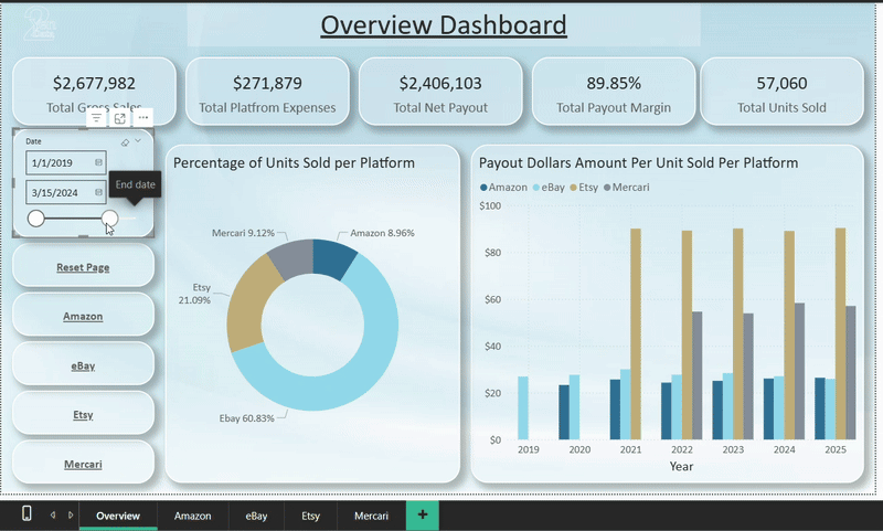
Overview Page
The overview page displays KPIs and charts that show the proportion of units sold across each platform, along with a performance measure that calculates dollars per unit to highlight the platform with the strongest return. Standard KPIs include gross sales, platform fees and expenses, net payout, payout margin, and units sold. A date slicer is included to track changes over time. All visuals, slicers, and metrics on this page can be adjusted to meet the client’s needs. Navigation buttons provide fast movement between pages.
Platform Pages
Each platform has its own page, and additional pages can be added as needed. The current version displays gross sales, platform fees, gross payout, payout margin, units sold, and a time graph showing percent change month over month. Each page also includes either top five country sales or top five shipping options, and the top five products. All visuals can be adapted to the customer’s requirements and the data they provide.


With this dashboard you can:
Unify all sales channels into one clear view
Identify your highest-profit platforms instantly
Access ready data to support confident decisions
Customize every metric to match your exact needs

Bring every sales channel into one actionable performance view—designed to answer the single question every e-commerce business asks: Where is our profit really coming from?
IoT Dashboard:
Summary:
With this dashboard you can:
Unify sensor data for faster, clearer operational decisions
Catch problems early with precise, real-time environment alerts
Remove manual logging through fully automated data collection
See critical trends instantly with a clean, smart dashboard
Overview
This dashboard uses generated sample data to demonstrate a scalable model that connects to IoT sensors for temperature, air pressure, and humidity. It can be expanded to include more devices and sensor types as needed
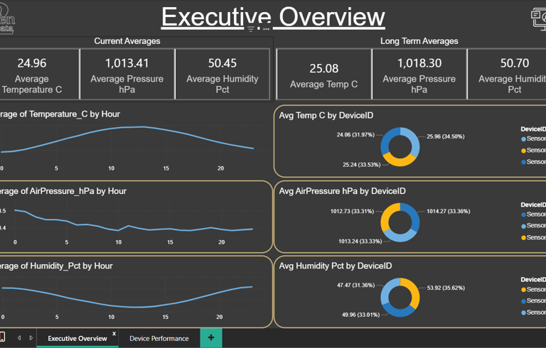
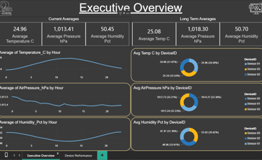
Daily Overview Page
The daily view shows a line graph of the current day and proportion charts for each device, making it easy to compare device performance and spot unusual readings
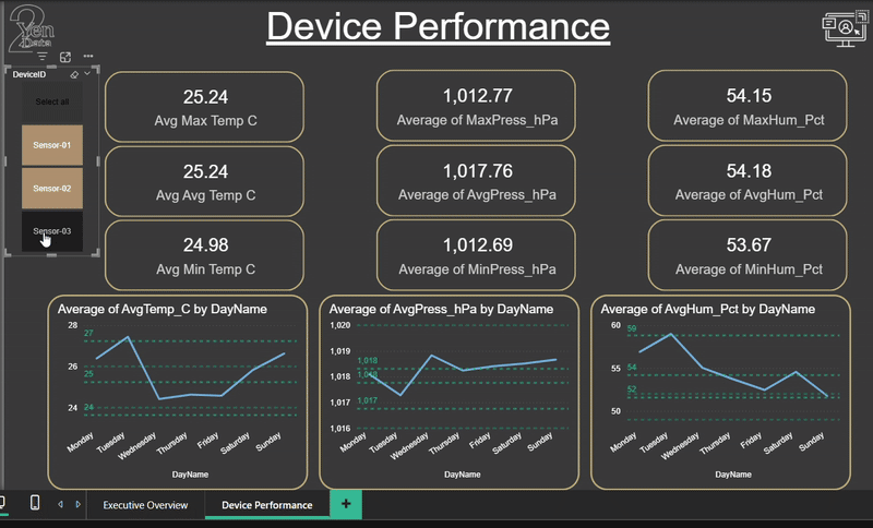
Device Performance Page
The performance view presents long-term data with KPIs and a detailed line graph, helping you analyze trends, check device health, and identify performance issues

Bring every sensor feed into one real-time performance view—designed to answer the question every operations team asks: What is happening in our environment right now, and where do we need to act?
Fraud Analysis Report:
Summary:
Dataset Overview
This analysis is based on a Kaggle e-commerce fraud dataset containing over 1.4 million transactions recorded between January 1 and March 31 2024. The report is divided into four sections: Fraud Overview, Fraud Over Time, Fraud Revenue, and Account Profile. Each page maintains a consistent set of key performance indicators (KPIs) along the top, enabling comparisons of how different dimensions influence overall fraud metrics. Navigation buttons are located in the lower-left corner, and each page includes a reset control for quick filtering resets.
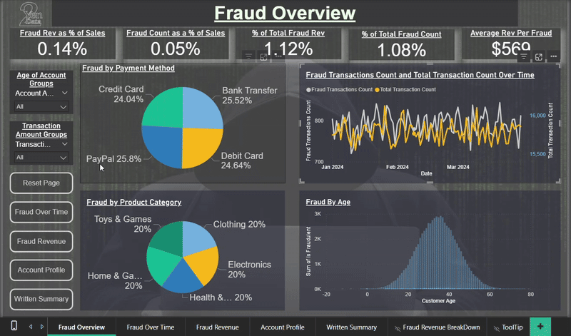
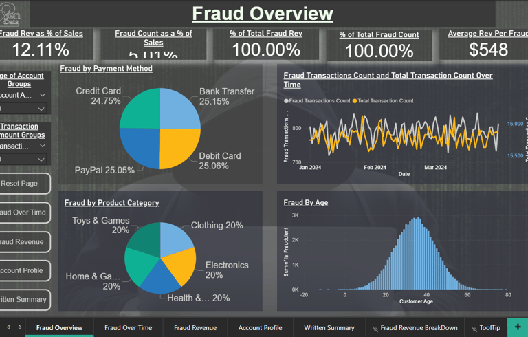
Fraud Overview
This section presents the primary metrics of the analysis. Fraudulent activity shows limited variation across payment methods and product categories, indicating these variables are not major predictors. However, fraud frequency increases with higher transaction amounts, suggesting value-driven targeting. Fraud by customer age follows a roughly normal distribution. The most significant correlates of fraud appear to be account age and transaction amount, both of which are explored further through interactive slicers on subsequent pages.
Fraud Over Time
This section examines when fraudulent transactions occur. Fraud levels remain relatively stable across the three-month period but reveal clear intra-week and hourly trends. The hourly chart divides the day into 24 segments, allowing users to identify peak fraud activity times and potential operational vulnerabilities.
Fraud Revenue
Here, both fraud count and revenue are segmented into ten transaction-value groups, highlighting where financial losses are concentrated. The analysis also includes the number of items per fraudulent purchase, providing context on how fraud behavior scales with quantity.
Account Profile
This section provides a behavioral snapshot of fraudulent accounts. Younger accounts exhibit higher fraud rates, reinforcing account age as a dominant risk factor. Fraudster ages are evenly distributed with a modest peak in the mid-thirties. The comparison of billing and shipping addresses shows minimal impact, and fraud appears evenly distributed across devices (desktop, tablet, and mobile), suggesting device type is not predictive.

With this dashboard you can:
Protect revenue with smart fraud monitoring
See key risk segments clearly
Align teams using accurate metrics
Improve outcomes with faster intervention
Unify your fraud signals, rules, and anomalies in one place—so teams know what’s safe, what’s suspicious, and where immediate action is required.
Wine Analysis Report:
Summary:
Dataset Overview
Thank you for visiting our Wine Analysis project, created for a fictional wine magazine called WineMag. This dataset includes over 120,000 wines, featuring data on price, rating points, geographic origin, and expert reviews. The ratings were provided by professional sommeliers, many of whom also wrote detailed tasting notes. You can explore the data by continent and country. From the main page, you can right-click any continent listed in the graphs to drill through to individual countries and the wines they produce. There are four buttons that guide you through different aspects of the analysis:

With this dashboard you can:
High-Value Wines At A Glance
Confident Choices Backed By Experts
Clear Pricing Drivers For Smart Buying
Flavor, Region, Rating — Decoded
Discover quality, price drivers, and tasting insight in one view, so buyers know what’s worth collecting, what’s worth sipping soon, and where real value hides.
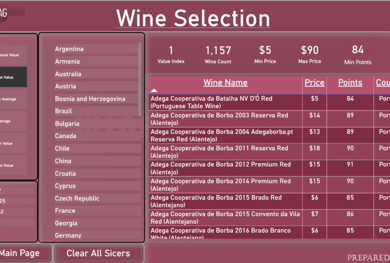
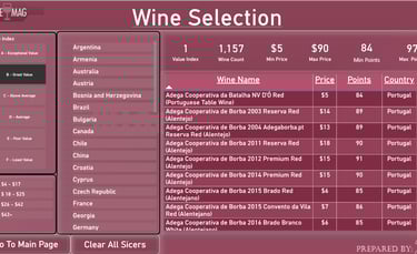
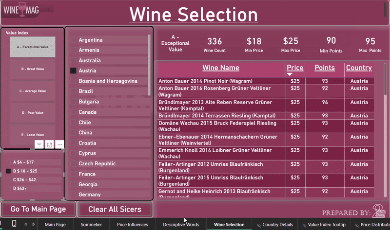
Wine Selection
Use this page to find wines based on price and quality. A custom value index was calculated by comparing a wine's price to the rating points given by sommeliers. This helps you discover great-value bottles. Tip: Hover over the index to see how it was calculated.
Price Influencers
Explore the key factors that influence wine pricing using Power BI’s Key Influencer visual. Note: This visual does not render when embedded on a website, but you can:
Download the .pbix file to view it locally in Power BI Desktop, or
View the report in full using Power BI Service.
Sommelier's Opinions
See which sommeliers contributed reviews and how they scored wines across different regions and price points.
Descriptive Words
Explore the language used by sommeliers to describe wines. This page breaks down common review terms by point rating level, offering insight into how quality influences tasting notes.
Marketing Campaign Report:
Summary:
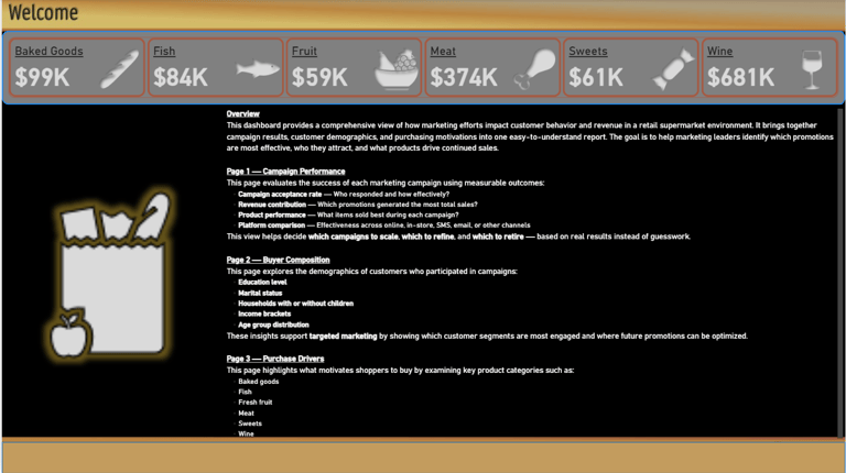
Marketing Campaign Dashboard Summary
Thank you for viewing our Marketing Campaign Dashboard. This project showcases a fictitious marketing campaign for a supermarket. The dataset includes six marketing campaigns that were created and promoted. It also contains extensive customer data, which we used to analyze how customer profiles and campaign exposure influenced sales across different product categories: baked goods, fish, fruit, meat, sweets, and wine.
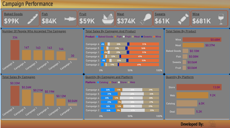
Campaign Performance
This page provides a breakdown of:
Which customers accepted the marketing campaigns
The products they purchased
Their preferred sales platforms
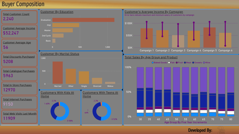
Buyer Composition
This section offers insights into customer profiles, helping us understand purchasing behavior by demographic. It also allows for comparison between customer groups and the campaigns they responded to.
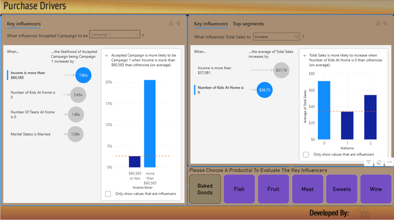
Purchase Drivers
This page highlights the key factors influencing sales, broken down by marketing campaign. The data is further segmented by product category to reveal what drives customer purchases in each area.
With this dashboard you can:
Invest In Channels That Actually Deliver
Real-Time Performance Drives Faster Wins
Focus On High-Value Audiences
Clear Next Steps For Stronger Campaigns
Unify campaign performance, spend, and audience behavior in one view—so teams see what drives conversions, what engages customers, and where scaling delivers the highest ROI.
Housing Market Report:
Summary:
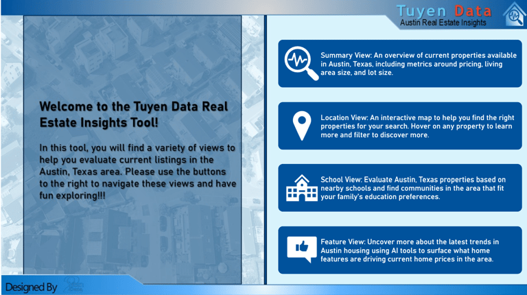
Housing Market Report – Austin, Texas
Thank you for viewing our Housing Market Report. All data in this report is sourced from the Austin, Texas area.
The report is designed as a single interactive page with a navigable cover page. You can access each section of the report directly from the cover page. On the main report page, use the icons in the upper left corner to quickly navigate to different sections.
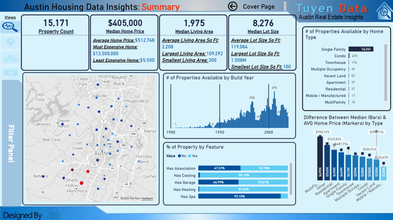
Summary
This section provides a high-level overview of the dataset. It includes:
Total listings
Average and range of prices
Home sizes and build years
Common features and home types
A location map of the properties
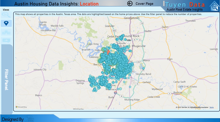
Location
This interactive map allows you to zoom in and out to view property locations across the Austin area. Hovering over a property will display a tooltip with detailed information about that specific listing.
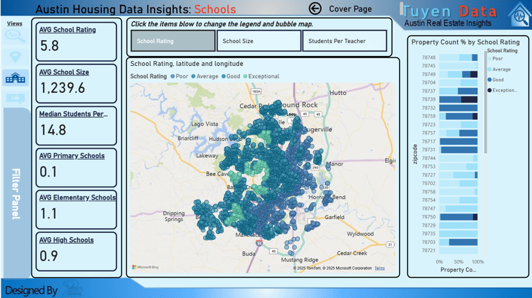
Schools
The Schools section provides details about schools in the area. You can:
Filter by school rating, school size, and student-to-teacher ratio
Zoom in on the map to explore the school zones and nearby properties in more detail
Key Influencers
This section analyzes how different home features impact property prices. You can:
View relationships between home attributes and pricing
Explore detailed data on specific properties
See a breakdown of descriptive words commonly used in property listings at various price points
With this dashboard you can:
Bring clarity to market trends
Quickly filter properties that match your goals
Spot high-value areas and neighborhoods with strong growth potential
Use interactive visuals to explore local markets down to the street level
Clear visibility into market trends, property value, and location strength, supporting confident decisions and strategic investment.
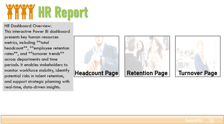
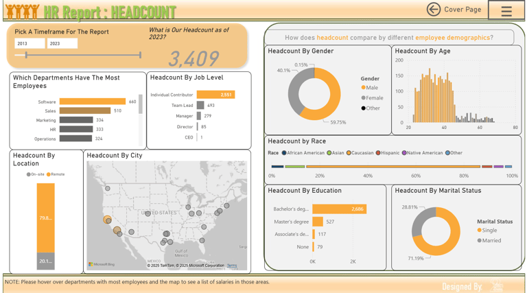
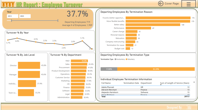
Human Resources Report:
Summary:
Thank you for reviewing our HR Analytics Report. This is a simulated dataset representing a company's human resources metrics. You can begin at the cover page and navigate to the Headcount, Retention, and Turnover sections.
Headcount
This section provides an overview of the company’s workforce. You can break down employee data by:
Department
Job Level
Location
Gender
Age
Education
Marital Status
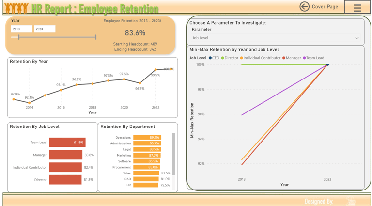
Retention
This page presents employee retention trends beginning in 2012, the company’s first year of operation. However, meaningful trend analysis is best viewed starting from 2013.
Visuals include:
Retention over time
Retention by job level
Retention by department
Key influences impacting employee retention
Turnover
This section displays employee turnover across the years, starting from 2012. You can filter by:
Job Level
Department
Reason for Termination
Termination Type
You can also click on an individual employee to view specific details related to their departure.
With this dashboard you can:
Clear view of workforce and HR metrics
Better talent decisions with actionable insights
Save time through automated reporting
Support growth and employee success continuously
Unify workforce metrics, hiring trends, and performance insights in one view. Empower leaders to strengthen teams, improve retention, and plan growth with confidence.
Get In Touch:
Address:
Plot 11c, Map Sheet 06,
Xóm Trung Thành, Xã Mông Hóa,
Hòa Bình City, Hòa Bình Province,
Vietnam
Contacts
+84 81 880 2787
admin@tuyendata.com