
Excel Projects Showcase
Explore Excel solutions designed to streamline reporting; automated workbooks, clean data models, and dashboards that support confident decision-making while freeing up time and reducing workload.
If one of these examples matches what you need, contact us. If not, custom builds can be crafted to your requirements.
Purpose of This Dashboard
This Excel data model connects directly to SharePoint, allowing you to upload new CSV files and refresh the workbook with a single click. All calculations, relationships, and visuals update automatically, providing a centralized and fully integrated multi-platform reporting system.
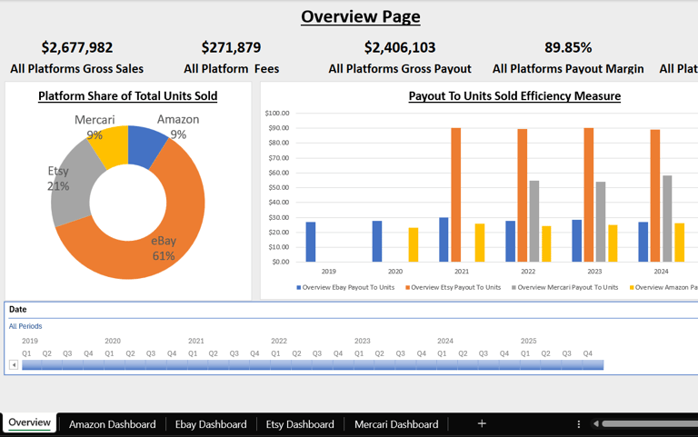
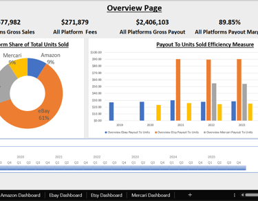
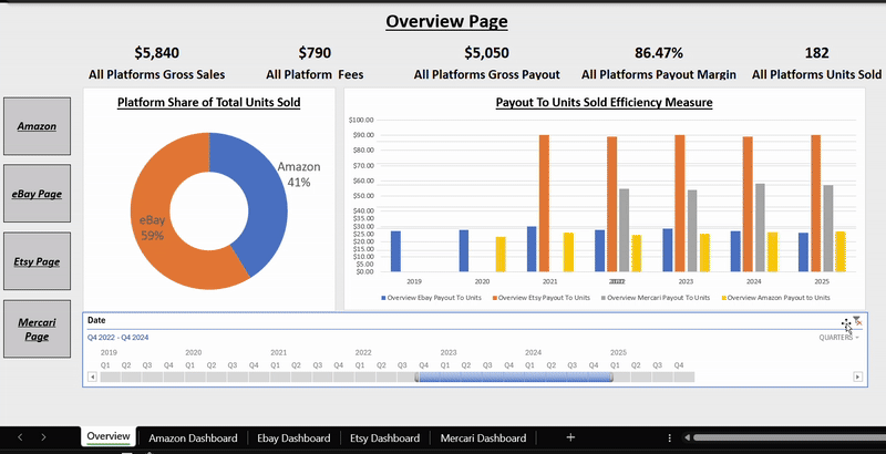
Overview Page
The Overview page displays a unified view of all connected platforms, showing their contribution by units sold, key efficiency metrics, and essential KPIs. A date timeline lets you isolate specific periods, and every chart and KPI responds instantly. Navigation buttons along the side allow quick movement between sections to explore each platform in detail.
Platform-Specific Pages
Each platform has its own dedicated page with KPIs tailored to that marketplace. These pages include a timeline chart showing month-over-month changes in sales, fees, and payout margin. Additional insights highlight top-selling products, countries, or shipping methods depending on the available data. This structure makes platform comparisons simple while still offering deep analysis within each one.
Customization and Scalability
This dashboard serves as a proof of concept and a demonstration of my Excel modeling skills. I can customize the data model to deliver the exact metrics a business needs and centralize data from multiple sales channels into one streamlined reporting solution. For larger or more complex datasets, Power BI is recommended, and the same multi-platform model is also available as a Power BI version.
Excel Multi-Platform Performance Dashboard:
With this dashboard you can:
Unify all platform data into one clean, refreshable Excel model.
Expose true sales, fees, payouts, and margins with clear, transparent metrics.
Compare platform efficiency instantly with payout, margin, and unit-based insights.
Summarize month-over-month performance at a glance for fast, confident decisions.
Summary:

Too many spreadsheets from too many platforms? This Excel dashboard consolidates everything into one view and reveals which products and channels actually drive profit.
Overview:
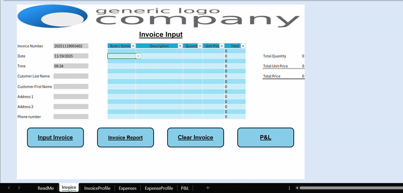
Thank you for visiting and taking the time to read about my Invoice Manager project. I created this tool to demonstrate how VBA (Visual Basic for Applications) can turn Excel into a powerful automation system for managing business data.
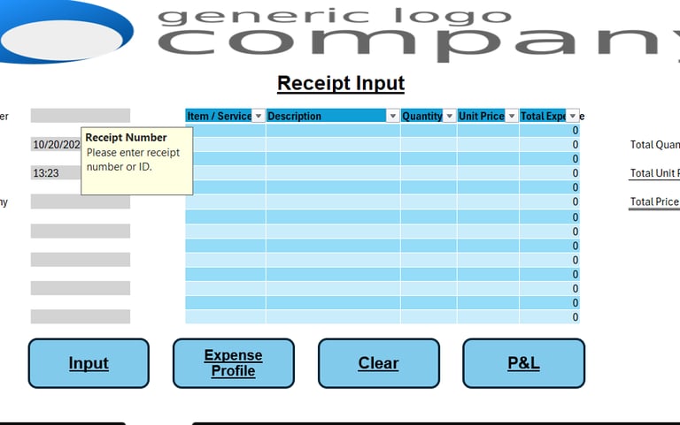
Smart Invoice Tracking:
Each invoice receives a unique identifier based on the exact date and time—down to the second—combined with the customer’s initials. The form captures all key details and stores them directly in Excel, ensuring your data is consistent and reusable.
Automated Data Validation:
Before saving, automated checks verify that entries are accurate and complete. With one click, you can generate an invoice report featuring a pivot table and pivot chart that summarize your results instantly.
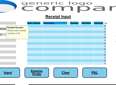
Expense Entry and Reporting:
The expense entry process works similarly, except receipts are entered manually since formats vary by customer. Expense reports can also be created with a single click, providing the same dynamic chart and summary capabilities.
Profit and Loss Snapshot:
For a quick financial snapshot, the Profit and Loss (P&L) button calculates all invoices, expenses, and your current net position.
Secure Data Storage:
All records are stored on a hidden sheet, protected by default but left unlocked so you can unhide it for advanced analysis or connect it directly to Power BI or other systems.
File Requirements:
This is a macro-enabled Excel file delivered as a ZIP archive. You will need to enable macros when opening it to access the full functionality.
Excel VBA Invoice Manager:

With this dashboard you can:
Save time with fast, automated invoicing.
Improve cash flow with clear payment tracking.
Stay organized with consistent financial records.
Auto-generate pivot tables, charts, and quick financial overviews.
Summary:
Problem: Invoicing is repetitive, error-prone, and easy to fall behind on.
Solution: Automate creation, storage, and lookup in one tool, freeing time for real work instead of admin.
Overview:
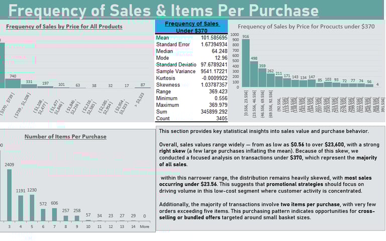
This Excel report provides a clear view of sales performance across time, region, category, and customer segment. It highlights trends, patterns, and anomalies that influence revenue and profitability, with a particular focus on how discounting affects margins.
Key Capabilities:
• Interactive tables and visuals for regional and category-level performance
• Profitability tracking with discount impact analysis
• Time-based trend evaluation to identify seasonal patterns
• Conditional formatting to highlight outliers and weak segments
• KPI summaries for quick managerial insight
Technical Highlights:
• Data modeling and structured tables in Excel
• Dynamic formulas and calculated fields for trend measurement
• Visualization using charts, slicers, and data-driven formatting
• Action-oriented layout designed for decision-making
Built to demonstrate how Excel can function as a full analytical environment, this report converts complex data into clear, actionable insights that support pricing, sales, and strategic planning decisions.
Superstore Analysis — Performance & Insights
With this dashboard you can:
Unify all platform data into one clean, refreshable Excel model.
Expose true sales, fees, payouts, and margins with clear, transparent metrics.
Compare platform efficiency instantly with payout, margin, and unit-based insights.
Summarize month-over-month performance at a glance for fast, confident decisions.
Summary:

Retail data often hides profit leaks. This Excel Superstore Analysis reveals which products earn, which discounts cut margins, and where performance can improve so you can make confident pricing and inventory decisions.
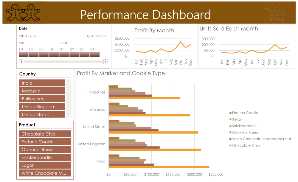
Cookie Company Sales Dashboard:
Thank you for reviewing this Excel dashboard. This report provides a clear overview of sales and profitability to support confident, data-driven decisions. It is designed as a single-page interactive view so insights are easily accessible. Slicers for country, product, and date allow users to filter results quickly and focus on specific segments of interest. Sales performance is visualized over time to highlight growth patterns and seasonal demand.
Profit by Month:
A line chart shows monthly profitability to help identify strong periods and opportunities for improvement.
Units Sold by Month:
A line chart tracks unit sales across months, providing insight into demand and helping with inventory planning.
Product Performance:
A bar chart compares results across products, making it easy to see which items drive sales performance.
Purpose of This Dashboard:
This report enables decision-makers to monitor key metrics, explore product and regional performance, and plan improvements using simple and interactive visual analysis.
Cookie Company Dashboard:
With this dashboard you can:
Gain rapid insight into business trends for faster decisions
Monitor key performance indicators in one organized view
Improve efficiency by reducing manual reporting time
Support growth with clear, data-driven strategy visibility
Summary:
See which cookies drive revenue, which ones drain margin, and how to scale production with confidence.
Get In Touch:
Address:
Plot 11c, Map Sheet 06,
Xóm Trung Thành, Xã Mông Hóa,
Hòa Bình City, Hòa Bình Province,
Vietnam
Contacts
+84 81 880 2787
admin@tuyendata.com