
Too Many CSVs, No Single View — The Tuyen Data Solution: A Unified Multi-Platform Dashboard
Too many CSVs and scattered reports? Learn how Tuyen Data unifies multi-platform sales data into one clean Power BI dashboard for fast insight, better decisions, and real business clarity.
Joe
12/5/2025
My post content
Please view the completed project here.
Section 1: The Problem
I was genuinely excited to build this dashboard because I kept seeing the same problem over and over—people selling online struggle to unify sales data from multiple platforms. While this challenge exists in many industries, it’s especially painful in eCommerce. Sellers may operate across Amazon, eBay, Etsy, Shopify, and sometimes regional platforms like Shopee, Lazada, Temu, or fast-growing marketplaces like Mercari.
With so many selling channels, keeping track of performance quickly becomes a nightmare. Every platform uses its own reporting format, field names, column structures, and export options. Nothing lines up cleanly. Manually stitching reports together burns time, increases errors, and blinds decision-making.
This felt like a perfect opportunity to build something I enjoy most: structuring messy data and turning it into an automated, unified view.
Section 2: The Objective
The goal was straightforward: create one dashboard that brings every marketplace together into a single source of truth. Instead of jumping between four or more spreadsheets, the user should be able to open one report and instantly answer key questions:
What are total sales across all platforms?
Which products perform best overall?
How do marketplaces compare month-to-month?
Where are revenue trends rising or falling?
What KPIs matter most for growth?
Success meant reducing manual work, centralizing metrics, and giving the business clear visibility without needing to merge CSV files every week. The dashboard needed to refresh cleanly, support unified KPIs, and present insights clearly at a glance.
Section 3: Data Sources and Challenges
Most online marketplaces provide sales exports in CSV format, even if some also offer APIs or direct connectors. For a first iteration, CSV works well because it keeps the process simple and universal across multiple platforms. With CSV as the input standard, I was able to leverage SharePoint as the automation layer. By storing all marketplace files in a SharePoint folder, Power BI could pull them automatically using the SharePoint Folder connector. Whenever new sales files are uploaded, a refresh in Power BI updates the entire dashboard without manual re-imports — a small but meaningful step toward automation.
Once the data reached Power BI, the real challenge appeared: every platform structures data differently. Field names, table layouts, metric definitions — nothing lined up cleanly enough to merge into a traditional star schema. Fortunately, the datasets were simple enough to remain flat files without heavy transformation. I kept Power Query light to preserve flexibility and avoid slow refresh times, pushing most logic into DAX measures and data modeling instead.
Because no single fact table existed that contained everything, I adopted a constellation schema approach. The unifying element was time — every dataset contained order dates. By creating a dedicated Date table in DAX, I could relate each marketplace dataset back to a central calendar, allowing trend analysis and unified metrics across Amazon, eBay, Etsy, and others.
With the relationships established, I built the standard measures — revenue, orders, units sold, AOV, and month-over-month changes — laying the foundation for visualization.
Section 4: The Build
With the CSV files stored in SharePoint and flowing into Power BI, the next step was to structure the model. To keep refresh performance fast and maintain flexibility, the raw CSVs were left largely untouched. Instead of heavy preprocessing, I opted to do minimal work in Power Query and handle most logic through DAX and data modeling.
The foundation of the model was a Date table — essential because time is the one dimension every platform shares. This allowed each marketplace dataset to connect through a central axis, forming a constellation-style schema rather than a traditional star or snowflake. Once the relationships were set, I created the core measures needed to analyze performance across platforms:
Row counts
Units sold
Gross sales
Net sales
Platform fees
Payout margin
Month-over-month change metrics
With the measures established, we moved into visualization.
Dashboard Design & Visuals
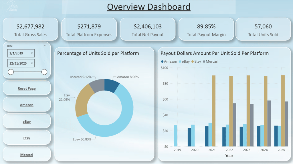
The Overview page presents high-level KPIs that summarize all marketplaces in one view:
Gross Sales
Platform Fees
Net Payout
Payout Margin
Units Sold
This gives decision-makers a fast, top-level read on performance. From there, visuals help compare marketplaces side-by-side. One example is a donut chart showing platform share by units sold. More insightful still is the payout-per-unit metric, which highlights where each sale is most profitable — a key comparison many sellers overlook.
Each individual platform page mirrors the Overview layout for consistency. They include:
The same KPI cards
Navigation buttons
Time slicers
Platform-specific trends and MoM visuals
Top 5 products
Top countries or shipping methods (when the data supports it)
The goal is to empower exploration without overwhelm. With dozens of potential metrics available, good design means prioritizing the data that actually drives decisions, not drowning the user in charts.
This dashboard creates a clean entry point for analysis today, while leaving room for deeper insights tomorrow.
Section 5: Future Automation Enhancements
This dashboard is designed as a foundation, but the next phase is automation. With the core model already structured, several enhancements can evolve this into a fully automated reporting system:
Automated file ingestion using Power Automate to detect new CSV uploads and refresh the dataset without user intervention.
API or connector integration for platforms that support direct data access, removing manual file exports entirely.
Scheduled refreshes and notification rules, including alerts when sales spike, fees increase, or certain products cross thresholds.
AI-driven insights highlighting anomalies, trends, or unusual performance patterns across marketplaces.
Each step moves the solution closer to true hands-free reporting — where decisions are made faster because data arrives ready, clean, and already visualized.
Section 6: Call to Action
Please view the completed project here.
If you would like a dashboard like this for your business or want to unify data across platforms, visit
Get In Touch:
Address:
Plot 11c, Map Sheet 06,
Xóm Trung Thành, Xã Mông Hóa,
Hòa Bình City, Hòa Bình Province,
Vietnam
Contacts
+84 81 880 2787
admin@tuyendata.com